Wednesday, 14 December 2011

Ancillary Products // Colour Scheme For Our Digipak

The colour scheme we have chosen we have agreed on for our ancillary products is black and white. We all agree that this would work well because black and white is commonly used with Indie bands. 

For the photos, we're thinking of using a long road with Jem and Zak (our artists)  standing alone on it. I think this would work well because it would really emphasize the artists and their Indie style.

The idea come from this picture.  

Ancillary Products // Font for our digipak


After looking at all the different fonts on Dafont.com, we as a group chose this particular font to use on our album cover. The font is called Bebas. We decided on this font because of its simplicity and how it is in showing the 'Indie' style. We don't want anything big or flashy because that wouldn't go with our bands image. This would also tie into other Indie bands because they normally use simple but effective fonts.

Ancillary Products // Planning

Here is my idea for my digipak.

We agreed as a group that we would use black and white for our colour scheme and add different shades or grey.


I've decided that I want to use pictures of Jem and Zak because they are the artists. I think a picture in two of the corners and the album name and band name in the other two would work well.


Also, I have the idea of using two pictures of guitars and placing them either side of the track listing, which I want going down the middle.


For the inside panel, I want to include acknowledgments and the band members names. Also, to include the names of people who helped create the album.

My Mock up

I have chosen to use a simple design to ensure I stay within the genre, also I chose to have it in black and white to stay within the genre this is very apparent from other albums in this genre. I also have simple pictures on a bench from the front and the back which also keep the album design constant.

Design of my digipak


This is a drawing of the design for my digipak. it is just a quick outlay of how my album digipak will look.

Colour scheme for our digipak


Our colour scheme for our music video is black and white. I feel that the simplicity of this will be very effective. It will be a black and white road with us standing on it like, similar to the picture above. 

Font for digipak


This is the font that we are going to use for our album cover. We got the font from Dafont.com. The font is called Bebas. It is a simple font but effective as we do not need anything big and flashy as we are a indie band and the album cover normally uses simple fonts for indie bands.

Tuesday, 13 December 2011

Digipak Dos and Don'ts

Some things I should include in my Digipak are:

  • Clear, appropriate fonts
  • Appropriately focused and shaped images
  • Ensure genre conventions and house styles are followed
  • Make sure the layout follows the rule of thirds
Some things I should avoid having in my Digipak:
  • Layer styles
  • Effects that are not genre appropriate
  • Text which covers the artist's face
  • Stretched images
  • Fonts which are difficult to read or colours which are too similar

Importance of a Digipak

A Digipak helps to attract an audience and also helps to promote the genre of music. A Digipak does this by showing how an artist looks, their genre of music and their style. Also all the important information associated with the artist is shown such as dates, websites and record labels. The Digipak also gives the chance for a lot more freedom for example thank you notes, free gifts and a chance to put their own personal stamp on the Digipak.

Analysis of Previous Student Advertisements


This advertisement seems to be clearly lacking in effort , The advertisement suffers the problems of the text being too also the text is difficult to read due to the similarity of the main colours. The lack of a professional font also hinders the advertisement as this makes it look less professional.

This advertisement on the other hand seems a lot better and a lot more professional than the first one this is because of the clear to read professional font the very clear, simple and strong colour scheme which makes this very appealing.

Thursday, 8 December 2011

Wednesday, 7 December 2011

Video feedback

After watching our music video at the Screen on the Green, I asked people, via facebook, to post some feedback for me.

Feedback from Nick Bor (Group 31) - part 1
Feedback from Nick Bor - part 2


Jaydan The'Game Man (a friend of mine who I asked to watch my video)
  • "From time to time the strumming of the guitar appears to be our of beat with the sounds in the song. 
    The appearance of the female in the video, was brief, and trivial, i would have liked to have seen more of her, or none at all. Temptation is not cool. 
    One person looked disinterested. I didn't feel a good vibe coming from him as he stared at his feet."

    Feedback from Aykut Kurt, another Media student - part 1


    Feedback from Aykut Kurt - part 2
    Feedback from Jake Phillips, another friend from outside college


    Analysis Of Digipaks Of Our Genre

    INDIE DIGIPAKS


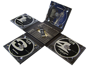
    This is a Digipak which relates to our genre of indie music.

    It has two colour schemes which are:

    this beige type of colour

    the blue
    this is very consistantly laid out throughout the Digipak CD Cover. They have also used this one image spread amongst each pane, so for example the front cover displays the face of the girl and inside displays the back.


    The text uses a very plain font to indicate perfection which contrasts to the album name as it displays 'flaws'.

    Analysis Of Three Previous Student Advert Work


    Overall this advert is really good and look very professional as it uses good use of images and text to completely cover the page leaving no obvious blanks.

    Good points


    • The colour scheme is consistant and pretty much uses only 3 main colours, Red, Black And White.
    • The Text seems very professionally laid out and covers the entire advert without explaining too much.
    • The font is also very good as it matches the type of music they are presenting, it uses 2 fonts which is really good as it doesn't seem overwhelming.
    • They have also included their Digipak CD Cover in the advert really effectively and seems very natural in the image as it doesn't effect any other part of the image.
    • Effectively Used a logo in the bottom right to cover the blank space.

    Bad Points


    • The girls are not smiling enough to present themselves as happy/joyful artists as their music entails them to be.
    • The use of iTunes and HMV logo is really basic and makes it seem very basic.
    ------------


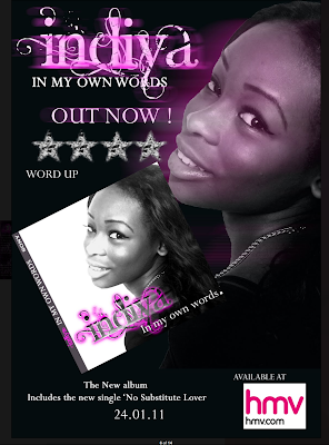
    This Advert is really really good i love how they have used the colour scheme of purple and black across her face as well as the title. 

    Good Points

    • The colour scheme is consistant throughout the advert as well as the CD Cover, the use of purple and black is very effective in this advert.
    • The Text 'Indiya" is really complex and actually suits this advert as well as the CD Cover, and is used really effectively in both with the mixture of black, white and purple.
    • Very nicely laid out, alot of the blanks are covered with either text of pictures.
    • The font is also very effective, plain and professional looking (other than "Indiya").
    • The CD Cover also very effectively placed in the advert.
    • The picture of the artist is also very good and the use of purple on her face adds to the consistency of the colour scheme.

    Bad Points

    • The HMV logo is very badly chosen as it stands out with the white and makes it seem like it has been very badly cut out.
    • The Stars are very weird and are not usually shown in adverts.
     --------------

    I really like this advert the colours used in this is very striking and consistant throughout the advert, i also really like the text and font used as well as where it is placed in the 'tear' of the image.

    Good Points

    • The Colour scheme is really good and consistently matching the text as well as the image.
    • The tear in the image so there is space for the text to come in and also makes the advert seem more interesting to look at as well as professional.
    • The font is really effective for this advert, as it is very professional for the BOLD CAPITAL writing and curly to show the girly side of the artist. The use of only 2 fonts makes it seem simple and more professional.
    • Effective use of the logos in the bottom right as it doesn't affect the rest of the advert and take the audience's attention away.
    Bad Points

    • There is no CD Cover on the advert.
    • There is also no album name included in the advert. 

    Other Student Digipacks and Adverts

    This student digipack is an example by a previous student, the artist  is called ‘Melody Davies’. The only thing that I like abut this digipack are the images of he artist because they are photographed really well because they look professional and they clearly thought carefully about the stance that she should take to convey to the audience of how she is feeling. However do not like the font used for the album cover, i feel it look cheap and unprofessional, it is hard to read in some cases and it makes the canvas look over crowded and to busy. 


    However i feel they did a lot better on the advertisement. The colours work much more than in the album, the introduction of the yellow makes it brighter and look happier. But the positioning of the text is a bit all over the place. 

    Using Photoshop Elements - Practise digipak

    Photoshop Elements

    When starting, you need to find the template and the images you want to use. You can do that by going to 'file' and 'open'.


    Different layers. Every time I added a separate text box or when I included an image, a new layer would be added. A box at the side of photoshop elements shows you all the different layers you've used. There is also an 'eye' icon which means you can chose which layers are shown. Clicking the icon next to a particular layer so it disappears means that the layer disappears to.


    This tool bar shows all the different tools you can use to edit your digipaks.


    • Hand tool - to move images and text boxes
    • Text box tool - to add text
    • Eraser tool - to erase
    • Paint tool  - to change the background to a specific colour
    And there are many more tools to use.


    These filter tools mean that you can change a picture to look like any one of the filters.  


    Each of the filter categories has sub-categories. After choosing the particular one you want, you can then adjust it to how you want it. You can do this by changing the width, pressure and brightness.


    After using all the tools and filters, I completed my practice digipak.


    Other Album Covers


    These three album covers are by bands that are similar to ours, as you can see they are very diverse in their approach to making album covers. Firstly The Kooks album is simple with them just sitting sown and a signature in the middle. This works well as it fills up all the space and gives you a lot to look at. The killers album is also good as it is a simple picture of them with a twist, they are floating. But my favourite one is the fightstar and it mixes simplicity with the weird and creepy. This is the most effective form of an album cover to me as it can mean many different things and is more interesting to look at.

    Practice Digipak

    Here is my practice digipak.


    I decided to go with the colours black and red because I think they are perfect for portraying heavier genres of music. Although this isn't the genre of my music video, I thought it would be a great way to experiment with creating a digipak if I did something different.

    I chose to darken the image of 'the artist' because the original was too bright for my colour scheme and wouldn't fit in. I thought the simplicity of only having one image would empathise the 'darkness' of the CD cover (as having more images would create more colour).

    I think creating the digipak for my band will be much easier now I know the basics.

    Using Photoshop Elements...


    i found that using photoshop was really fun and easy to use, especially being able to cut around Dan's head and being able to place his head anywhere around the panes.

    Using the text function was also really easy also using skew to make the text seem like it is actually attached to the wall.

    Editing the images was also very easy to do, such as the right pane i made look completely blacked out and blurred the two colours together so it the mixture of the two seems gradual and not too obvious.

    Using gradients that match the colour scheme on the other panel to keep the colour scheme consistant throughout the Digipak.

    Improvements


    i would have liked to add record companies and the text that is usually found at the bottom of the back page.

    improve the spine of the Digipak so it doesnt look too obvious when looking at all of the pages together.

    Tuesday, 6 December 2011

    Researching Ancillary Products- Analysing 3 Digipaks That Relate To My Artists Genre


    The Kooks are a band we compared to our artist mainly due to the similarities between the conventions of our bands. I like this Digipak because of the clear font used and the simplicity of the cover expresses the feel of the songs, the band and of the genre. The font and image sizes are also appropriate for the genre, also the names of the band and the album stand out against the white background. The simplicity of the album cover suggests the songs on the album have a degree of simplicity surrounding them.

    Digipak Ideas


    Another important element for our Digipak is the name of the album. I have researched some albums from our genre and what I have discovered is that the album names are relatively random. They have seemingly no link to the band name or the titles of songs. They are all quite quirky and have simple names as can be seen below.


    Your image is loading...

    Imroved skills- Filming and Editing

    Over the last 2 months I have constantly been developing my filming and editing skills. I believe the filming and editing processes were a lot more complicated this year compared to the AS year. One of the main reasons for the difficulties was the amount of cuts needed to keep the video engaging and also to give a professional feel to the music video.


    During the editing process I consistently used Final Cut Pro this has given me the opportunity to learn a variety of new features. One example that we used on our video was the effect that allowed us to split our images and also to make images slide on and off screen.

    Furthermore I learned the importance and usefulness of markers throughout editing process as it helped us to cut the clips on the beat of the song. We also used the cutting tool throughout the editing process and it proved to be very helpful when cutting clips to the beats of the song.

    Monday, 5 December 2011

    Practice Digipak


    I chose to do a dark Gothic digipack for my practise. I went for a simple picture on the front cover, because the picture is creepy and when you look at it you notice that their are two pupils which connotes the image that i am trying to portray in the weirdness of the album. However their were a lot of improvements that could be made, firstly their are no record label logos. Moreover the photo shoped image of Dans head onto a hot girls head is slightly creepy and that is probably something not many people would be a fan of to buy the album. Also the album cover is a bit simple and could be made a bit more interesting by placing another image on the front cover. 

    Digipak Practice Attempt


    This is my practice Digipak design 

    i have chosen to used a very contrasting shade of colour scheme...i have matched the rest of the light areas with the same colour of the wall on the right pane. The text is very curly to show that the track is alot to do with emotions. The text is also embossed to give the effect that it is coming out of the walls aswell as the page.

    Friday, 2 December 2011

    Ancillary Work

    A digipak is the current modern approach to packaging CD/Albums for its customers. It is used to convey information about the Artist and genre as well as alittle about what the songs entail.


    People STILL use CDs and therefore the music industry have found this modern way of attracting customers to buy Digipaks, as it usually contains a few surprises here and there (artwork etc).


    However these are usually targetted at those people who are still finding it hard to download music and prefer a tangible copy of the music as well as encourage people to buy music instead of illegally downloading them.


    We were also introduced to the conventions of a digpak which include things like :


    • Text - usually consisting of 2-3 fonts to ensure it isn't too overwhelming and makes it more simple and prefessional
    • Track Listing - List of the Tracks usually at the back of the cover
     
     
    • A Main Image - this is usually an image of the artist or an image the song is related to in some way, or even an image to convey a message. 
     
     
    • Logos - Record company logos are very common and is usually placed at the back of the cover near the barcode.
    • Promotional stickers most likey to be used if an artists has an upcoming or has recently been on tour