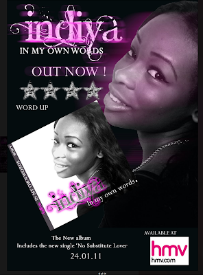
Overall this advert is really good and look very professional as it uses good use of images and text to completely cover the page leaving no obvious blanks.
Good points
- The colour scheme is consistant and pretty much uses only 3 main colours, Red, Black And White.
- The Text seems very professionally laid out and covers the entire advert without explaining too much.
- The font is also very good as it matches the type of music they are presenting, it uses 2 fonts which is really good as it doesn't seem overwhelming.
- They have also included their Digipak CD Cover in the advert really effectively and seems very natural in the image as it doesn't effect any other part of the image.
- Effectively Used a logo in the bottom right to cover the blank space.
Bad Points
- The girls are not smiling enough to present themselves as happy/joyful artists as their music entails them to be.
- The use of iTunes and HMV logo is really basic and makes it seem very basic.
------------
This Advert is really really good i love how they have used the colour scheme of purple and black across her face as well as the title.
Good Points
- The colour scheme is consistant throughout the advert as well as the CD Cover, the use of purple and black is very effective in this advert.
- The Text 'Indiya" is really complex and actually suits this advert as well as the CD Cover, and is used really effectively in both with the mixture of black, white and purple.
- Very nicely laid out, alot of the blanks are covered with either text of pictures.
- The font is also very effective, plain and professional looking (other than "Indiya").
- The CD Cover also very effectively placed in the advert.
- The picture of the artist is also very good and the use of purple on her face adds to the consistency of the colour scheme.
- The HMV logo is very badly chosen as it stands out with the white and makes it seem like it has been very badly cut out.
- The Stars are very weird and are not usually shown in adverts.
I really like this advert the colours used in this is very striking and consistant throughout the advert, i also really like the text and font used as well as where it is placed in the 'tear' of the image.
Good Points
- The Colour scheme is really good and consistently matching the text as well as the image.
- The tear in the image so there is space for the text to come in and also makes the advert seem more interesting to look at as well as professional.
- The font is really effective for this advert, as it is very professional for the BOLD CAPITAL writing and curly to show the girly side of the artist. The use of only 2 fonts makes it seem simple and more professional.
- Effective use of the logos in the bottom right as it doesn't affect the rest of the advert and take the audience's attention away.
- There is no CD Cover on the advert.
- There is also no album name included in the advert.


No comments:
Post a Comment