Showing posts with label Fuzail Ismail. Show all posts

Tuesday, 24 January 2012

Evaluation Question 4

Audience Feedback For The Music Video


My own feedback on the music video   


GoAnimate.com: Feedback by reyes_z3

Like it? Create your own at GoAnimate.com. It's free and fun!

Audience Feedback for my Digipak


here are a few comments on the design i got from facebook.


The feedback i recieved helped alot, it helped me narrow down what was wrong with my Digipak and also gave me a few pointers on how to improve it. 

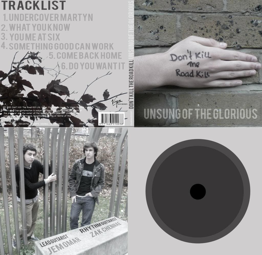
Here is the comparison between the rough design and the final version.


I had to make a few changes to the front panel because of the feedback i recieved:
  • the tracklist had to be altered and made longer and therefore made a gap underneath the tracklist which i still dont like. 
  • I had to change the record label from Virgin to Mercury because i was using the wrong logo.
  • The font had to be change for the copyright message, as i happened to be using 'Comic Sans'.
The inside panel had to be altered too:
  • The text was adjusted, as the perspective did not seem right. 
  • The CD holder was made transparent
  • An image was placed behind the CD holder.
Overall i am happy with the final result of the Digipak and music video, although i still feel like we could have improved the music video alot more, it did come out alot better than i had imagined.

Friday, 20 January 2012

Evaluation Question 3 - How did you use media technologies in the construction and research, planning, and evaluation stages?


Here is a video of me during the editing process:


 i was lining up all the base tracks to the song, in order to make the lip sync as close as possible to the song.


Alot of the technologies i used throughout the research and development process helped to make everything alot easier to manage aswell as implement.

  
Here was an idea we originally had during the start of editing the footage


we planned to have a split screened version of two different locations, but later realised we could include all four locations and it would look alot better aswell. 

Here I have included a screenshot of how I laid out each clip so that it would seem like the clips have been animated on and come on at different times, as well as flash to the beat.


This is our animated storyboard, it has the basic ideas of how we we wanted it to be and looking back at how we thought the music video will eventually turn out, it actually turned out to be alot better than we imagined!

Thursday, 19 January 2012

Evaluation Question 2 - How Effective Is The Combination Of Your Main Product And Ancillary Texts?


The Digipak aswell as the advertisements has a visual link with the music video we produced, however it seems to be a hidden link and possibly not as obvious to the audience. 
The visual link is the environment around the band during the music video and the ancillary products.

In the music video we have 4 locations in which the footage is shot in:


Each of these locations have greenery in the background and we have specifically decided on this as it would help us to link our music video to the Digipak as well as the advert.


The Audience might find it difficult to spot the link, however they will be able to recognise the visual link as linked products through the use of images i have used in the Digipak as well as the Advert.


The images i used in the Digipak were specifically designed to make it seem like the environment was wrapping around the band members and in the advert it seems to be wrapping around the Advert. However in the music video we havent shown this clearly, however we have shown them to be constantly followed by the environment behind them.


My Main and Ancillary texts are used extremely well however dont reflect the visual links between the music video and my ancillary products. 

These texts are from both the Digipak And The Advert and are consistant to one font, Bebas. Although texts does not stand out as much through using two or more fonts to emphasise certain information, i decided to use one font to make the entire Digipak as well as the Advert have a constant design scheme. 


Therefore, where i have needed to emphasise certain information i have used different shades of the same colour to make some texts stand out more than others to catch the audiences attention.

i think it will attract our target audiences, it is something different and alot of Digipaks as well as the Advert don't really use one simple font just as i have and also use different shades to emphasise points or certain text.


It also helps to portray the indie genre of our band through being different and independent.

Here is a Digipak that i had previously reviewed:


After seeing this i immediately liked the layout and the way the text is very simple and only bolded to show emphasis on the band name. It is very simple yet looks really good and easy to look at. 
I didn't initially decide to use this kind of layout but as i was designing the Digipak it came naturally to follow this simple layout.

The advert however was just simply made through looking at the Digipak and assuming how the advert should look and also link back to the Digipak.

I did look at a few examples but i couldn't find any professional adverts and found a few student made adverts:

Although these student made adverts didn't look appealing to me i did manage to find a simple student advert:

 The Title/Heading of this Advert was the only thing i implemented into my Advert, the way the text is laid out and the Digipak is in the centre of the Advert to catch the audiences attention.

Wednesday, 18 January 2012

Evaluation Question 1 - In What Ways Does Your Media Product Use, Develop Or Challenge Forms And Conventions Of Real Media Products?

Music Video Influences


Digipak Influences

I had trouble finding inspiration towards my Digipak during the first few stages of production. Alot of the Digipaks I researched on through google were not really that good. Most of them used bright colours and images to make them stand out more, however i had a set black and white colour scheme to abide by and these Digipaks were not helping me at all.

Initially i had trouble starting on my Digipak 


Looking at my initial design, it is pretty obvious i had trouble with the layout of the text as well the colour and font. I liked the colour scheme i used and therefore kept it throughout the Digipak, however i knew i needed to research on a couple more Digipaks with similar colour schemes and perhaps get ideas on where things should be laid out. 

Eventually i came across this Digipak


The first thing i noticed was the colour scheme and how it is continually carried out through out all the panels, including the CD. The simple scheme makes the entire Digipak easy to look at and also through the use of its text, attracts the audience's attention towards it.


The text uses one main font and bolds certain text to show/emphasise the information and make it stand out more. The use of it's simplicity makes the Digipak even more effective, easy on the eye and alot less overwhelming for the audience. 

However, because it only uses one colour it lacks the dynamism a Digipak must have to hook the audiences attention and make them feel like they want to know more about this artist or band etc. But this can also be achieve through mysteriousness, like how 'Feeder' have done with this Digipak, using less text and simple layouts and colours to make this Digipak more appealing.

I therefore implemented this idea into my own Digipak


I used the same Bebas font thoughout my Digipak, but instead used different shades of the same colour to make certain text stand out more than others to grab the audience's attention.

I also liked the way 'Feeder' have laid out the texts over their images. There is very few text and where the text covers the image it does not obscure the image.

I have also implemented this idea into my Digipak


The front panel and the inside panel both have very few text over the images, however i have placed them out of the way and are slightly hard to notice. This is because of our genre, the indie genre is based around the idea of representing the 'band image' and therefore instead of using text to show this, i am using the images to express the band's true thoughts and lifestyle to the audience.

Tuesday, 10 January 2012

Saturday, 7 January 2012

Comparison...


This is the old design i originally started off with, i messed around with a couple images and finally landed on using the hand image for the front cover. The Font i kept throughout the digipak was bebas, whereas in the initial design i used two different fonts.


i really like the new design and i'm glad i changed it. it looks alot more professional and the colour schemes match perfectly with the text aswell as the images.

Thursday, 5 January 2012

Getting Started...


i have started working on my digipak cd cover and have kept to the black and white colour scheme.

Wednesday, 4 January 2012

Implementation of DKTRK Layout


The font used in this is not Bebas, however i used 'Cooper Std' instead because the font made the output seem closer to what i expected and so Bebas may have to be used as the secondary font.

A Few Photos For The Digipak

Here are a few photos from the 'Photoshoot' we had to take pictures for the Digipak