From the feedback from the audience I have learned many things. On the whole the audience seemed to enjoy our music video, the main positive point we received was that we used the mise en scene very well and cut to the beat excellently and this helped to appeal to our genre. I feel these comments are appropriate as we worked very hard on making sure the mise en scene would contrast the background and this was reflected in the audiences feedback as they appreciated the mise en scene. One of the main criticisms was the we didnt use enough angles throughout our music video. This is a very fair point and on reflection I feel I should definitely have used more angles. I probably could have used angles from the sides more often and tried to use more of the moving camera. However, one of the main reasons we didn't use lots of angles was the idea behind our music video which was to be different from mainstream videos and be quirky. But I now feel after receiving the feedback that we should have used more of a moving camera and tried to include more camera angles. The feedback also makes me feel like we should have been more flexible with our idea and this would have led to us using different angles.

Showing posts with label Zakariya Chennane. Show all posts
Showing posts with label Zakariya Chennane. Show all posts
Thursday, 26 January 2012

Wednesday, 25 January 2012
Evaluation Question 2
How effective is the combination of your main product and ancillary texts?

My advert is very effective in relation to my video, the clear links are the the very simple dress code and emotionless, laid back attitude of the artists. Throughout our music video the dress code remains very basic and is not extravagant, also the artists are not performing the song by moving around putting lots of effort in to it. This is reflected in my advertisement as both artists are leaning on a wall which is a clear link to the laid back attitude from the video. Also both artists reflect the emotionless attitudes that where displayed in the video, both artists are not showing any specific facial expressions in the advertisement which is a constant element in our video. The black and white effect helps to keep the image seemingly simple which is another recurring element of our music video. This also would be very appealing to the indie genre's audience, as the audience are famed to prefer non-mainstream products. This was a strong motivation behind my advertisement and this was one of the main reasons for the black and white design and also why I tried to keep the advert simple but different. A typical aspect of the indie genre which an indie audience would look for would be to have a certain quirkiness which is not so apparent in most mainstream songs and most genres. This was another reason for the black and white advert as it is quite uncommon in the music industry, also most adverts from other genres show artists in special poses or in extravagant outfits but my advert challenges those conventions and shows the artists in relatively average clothes in a relaxed pose. This would make the advert very appealing to the target audience as these are the conventions of the indie genre and also it is not mainstream which is another aspect of the indie genre.


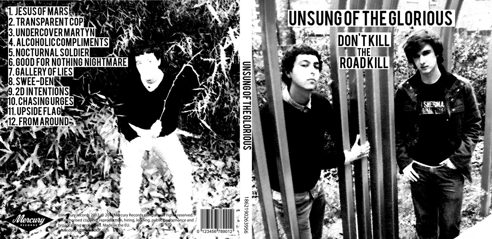
My CD cover has many links with the music video which the advertisement also has, the images are all black and white which emphasises the simplicity and the non-mainstream elements of the indie genre, which are both elements of the music video. Furthermore the cd cover shows the quirky style which appeals to the target audience of the indie genre, through the image of the hand and the black and white effect. This quirkiness is also apparent in the music video as the music video shows a lot of different effects through the jump cuts and the sliding images which aren't typical aspects of most genres and this quirky idea also is a strong convention of the indie genre and so would appeal to the audience.
Evaluation Question 3
This is a video of when we used final cut to edit our music video it took a lot of time and effort as final cut was a tricky programme. But it was very important for editing especially considering our idea which needed lots of very specific cuts. Also the the sliding images was another reason why final cut was a vital technology during the production process.
This is our animatic by the end of the production of our music video a lot of our original ideas from the animatic stage had changed, but I do feel all of those changes were for the best.
Monday, 23 January 2012
Evaluation question one
When we started the planning process we wanted to make sure our music video was unique, different but also wanted to fit in with conventions of the indie genre, we did this by using similar camera shots with quirky editing and quirky mise en scene which is a convention of the indie genre. The unique idea we had was for different costumes in different places but then we altered this to contrast our costumes with the places we were filming to make sure we also challenged some of the conventions. For example we used pyjamas in a business area and we used suits on a roof top with flats in the background.
The main influence behind our music video was 'something good can work' from Two Door Cinema Club, they used very fast cuts which where cut to the beat. Also the background colour also changes along with the artists moving all over the screen, the main difference is the changes in costume we use throughout. Also the camera is very still in this music video and stays at the same distance we also took this idea and applied it to our music video but we did include some moving shots and some broke the screen into four to give us a different element to our music video.
This is another media groups music video we came across on youtube it was very helpful as it taught us how to move the camera in a special way. We decided to use this effect to conclude our music video and it seemed very effective.
We also used an idea from another Two Door Cinema Club song our idea was to use a female in our music video that the song is directed towards. This would give our music video another element and also fit the conventions.
Our digipak is quite conventional as it is simple and quirky which is very similar to the kooks album cover. Both our album covers are black and white with stand out text. We also used our black and white theme throughout, our quirky image of the hand also matches the genre.


Wednesday, 11 January 2012


Wednesday, 14 December 2011
My Mock up

Tuesday, 13 December 2011
Digipak Dos and Don'ts
Some things I should include in my Digipak are:
- Clear, appropriate fonts
- Appropriately focused and shaped images
- Ensure genre conventions and house styles are followed
- Make sure the layout follows the rule of thirds
Some things I should avoid having in my Digipak:
- Layer styles
- Effects that are not genre appropriate
- Text which covers the artist's face
- Stretched images
- Fonts which are difficult to read or colours which are too similar
Importance of a Digipak
A Digipak helps to attract an audience and also helps to promote the genre of music. A Digipak does this by showing how an artist looks, their genre of music and their style. Also all the important information associated with the artist is shown such as dates, websites and record labels. The Digipak also gives the chance for a lot more freedom for example thank you notes, free gifts and a chance to put their own personal stamp on the Digipak.
Analysis of Previous Student Advertisements

This advertisement seems to be clearly lacking in effort , The advertisement suffers the problems of the text being too also the text is difficult to read due to the similarity of the main colours. The lack of a professional font also hinders the advertisement as this makes it look less professional.

This advertisement on the other hand seems a lot better and a lot more professional than the first one this is because of the clear to read professional font the very clear, simple and strong colour scheme which makes this very appealing.
Tuesday, 6 December 2011
Researching Ancillary Products- Analysing 3 Digipaks That Relate To My Artists Genre


The Kooks are a band we compared to our artist mainly due to the similarities between the conventions of our bands. I like this Digipak because of the clear font used and the simplicity of the cover expresses the feel of the songs, the band and of the genre. The font and image sizes are also appropriate for the genre, also the names of the band and the album stand out against the white background. The simplicity of the album cover suggests the songs on the album have a degree of simplicity surrounding them.
Digipak Ideas
Another important element for our Digipak is the name of the album. I have researched some albums from our genre and what I have discovered is that the album names are relatively random. They have seemingly no link to the band name or the titles of songs. They are all quite quirky and have simple names as can be seen below.

Imroved skills- Filming and Editing
Over the last 2 months I have constantly been developing my filming and editing skills. I believe the filming and editing processes were a lot more complicated this year compared to the AS year. One of the main reasons for the difficulties was the amount of cuts needed to keep the video engaging and also to give a professional feel to the music video.
During the editing process I consistently used Final Cut Pro this has given me the opportunity to learn a variety of new features. One example that we used on our video was the effect that allowed us to split our images and also to make images slide on and off screen.
Furthermore I learned the importance and usefulness of markers throughout editing process as it helped us to cut the clips on the beat of the song. We also used the cutting tool throughout the editing process and it proved to be very helpful when cutting clips to the beats of the song.
Monday, 28 November 2011
Digipak ideas

I have been researching album covers to take inspiration from for our band 'Don't Kill The Road Kill' and these are few I feel relate to our genre. We looked at both Noah and The Whale and The Kooks when choosing our song but decided on Two Door Cinema Club. I like the idea of the band members sitting down playing guitars as I feel we would be able to add effects similar to Noah and The Whale's album cover. The Two Door Cinema Clubs album cover is very random and will fit our music video but I feel we could have a better video if we use a similar cover to The Kooks and Noah and The Whale.
Feedback on the Roough Cut
We were lucky enough to be able to get strong feedback both negative and positive from both students and teachers. Teachers told us we were working at an A grade standard but it was a relatively low level A, this was due to the shots being quite static and repetitive even though we show good consistency throughout. The teachers also commented on our high level and detailed planning of our music video. We made sure locations, costumes, times and dates were all specifically laid out, this meant filming could take place almost immediately on the filming day as all the aspects had been intricately planned. This feedback lead to us as a group deciding to add some special effects to our video as the majority of our favorite shots were only filmed from static positions.
Romantic Element
We decided as a group to include a romantic element to our music video. We felt it would be a different aspect for the music video instead of the same edits and people throughout. This meant we needed to find a girl to play a female's role in the music video, we managed to get a girl called Olivia who even though wasn't a media student was willing to play a part in our music video. She was perfect for the role as her image was ideal for an indie music video and typical of the genre. Our idea was to have her at the slow parts of the song with the main singer, this worked out to be a very good element to add to our music video.
Thursday, 24 November 2011
Finally Finished Editing
 We have now finished the editing process, and are exporting it into a quicktime movie.
Thursday, 17 November 2011
Subscribe to:
Posts (Atom)